White balance plays a vital role in successful photography, but it is not always clear how (or why) we should colour correct our images. In this post we will be paying some attention to this overlooked, underrated, but altogether game-changing function, including:
- Why white balance matters
- How temperature and tint work
- Auto White Balance vs. Manual White Balance
- How to use a grey card
- Lighting for neutral images
- Ways to use colour balance creatively
So Why Does White Balance Matter?
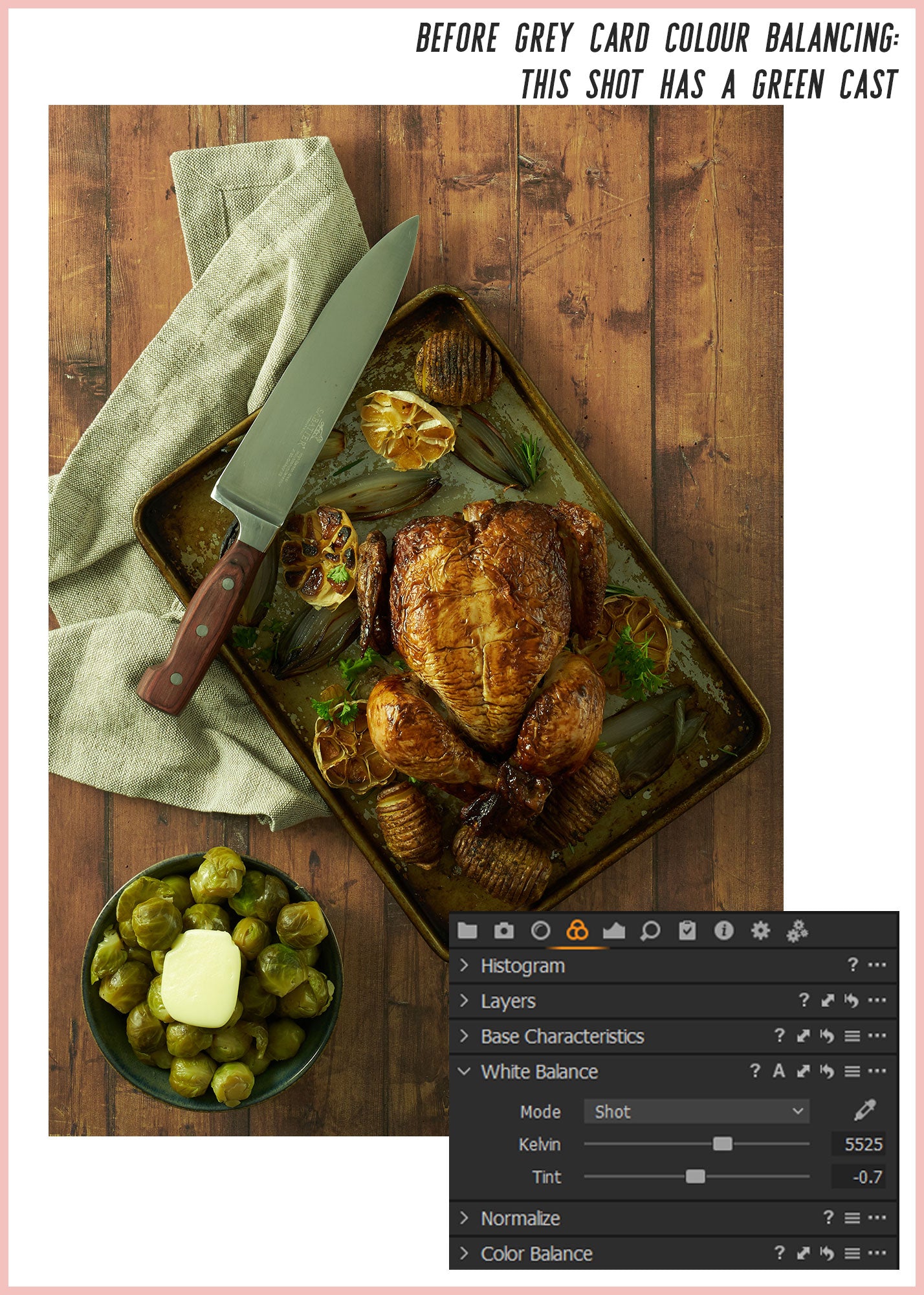
This question is most simply answered by looking at a photograph that has not been properly white balanced.
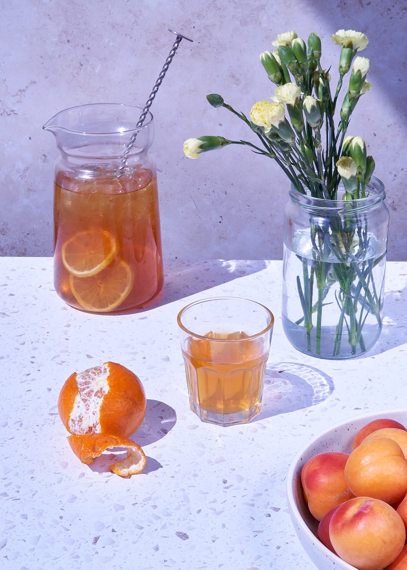
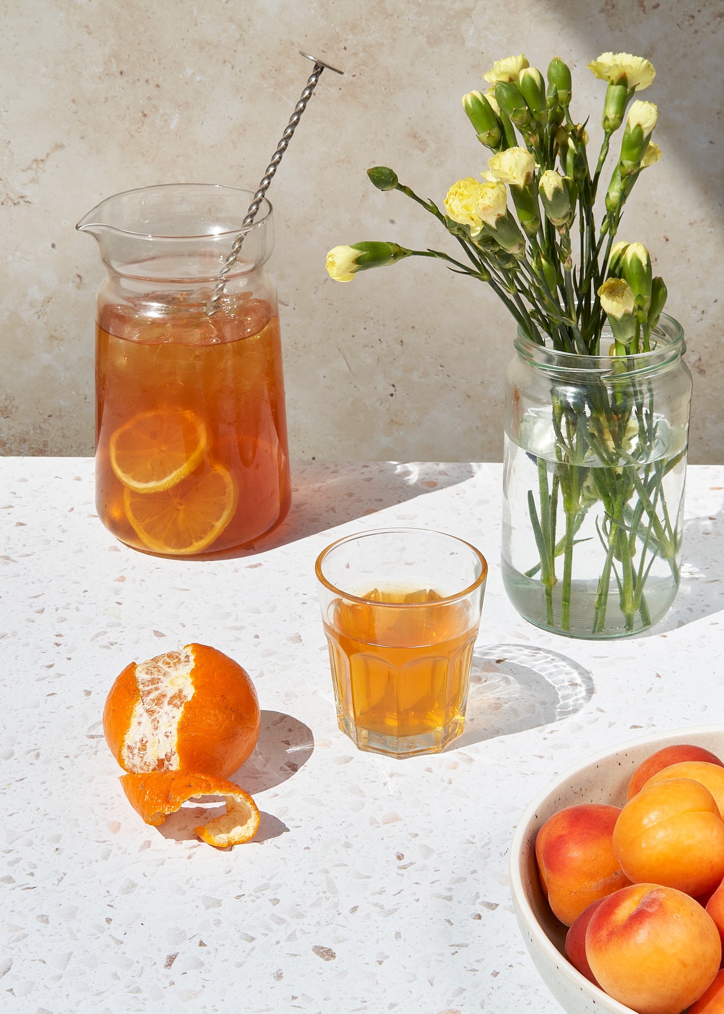
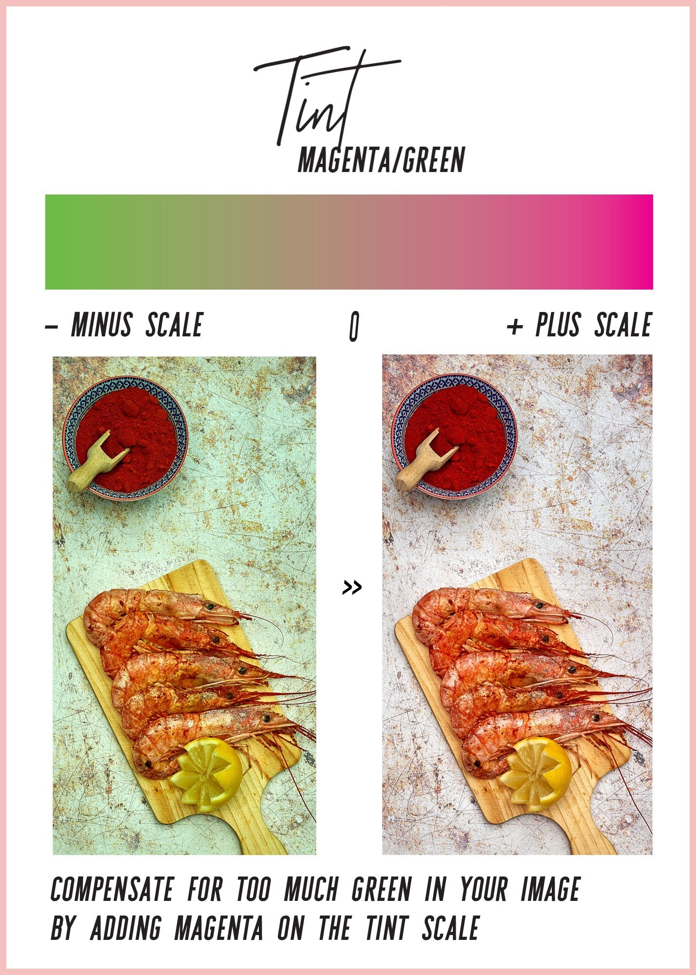
These images show the same daylight scene before and after white balancing. Incorrect colours make the whole shot look unnatural and unappealing:
When we look at our surroundings, our eyes have the ability to naturally 'white balance' what we see. A sheet of paper seen outside in the sunshine will look equally white as when seen in an interior, lit by a lightbulb. We perceive our environments as neutral, but cameras see light differently from our eyes. Objectively, the daylight outside has a blue colour cast, while the standard interior lightbulb has an orange cast. By changing White Balance settings we can neutralise these differences in colour temperature and tint.
And, because white balancing lets the camera see like our own eyes, it's importance shouldn't be underestimated. If your shot is well composed, correctly exposed, but still seems somehow 'off'; Or if the photographed image does not look the same as it does in the viewfinder; The easy solution could be in the White Balance settings you are using.
How Temperature and Tint Work
White Balance is made up of two elements: Colour temperature (measured in Kelvins), and Tint. Temperature places light sources on a numbered scale from warm reds and yellows, through neutral tones to cool blues. The scale starts at 0 and goes up to over 10,000, with lower numbers representing the hotter end and higher numbers the colder.
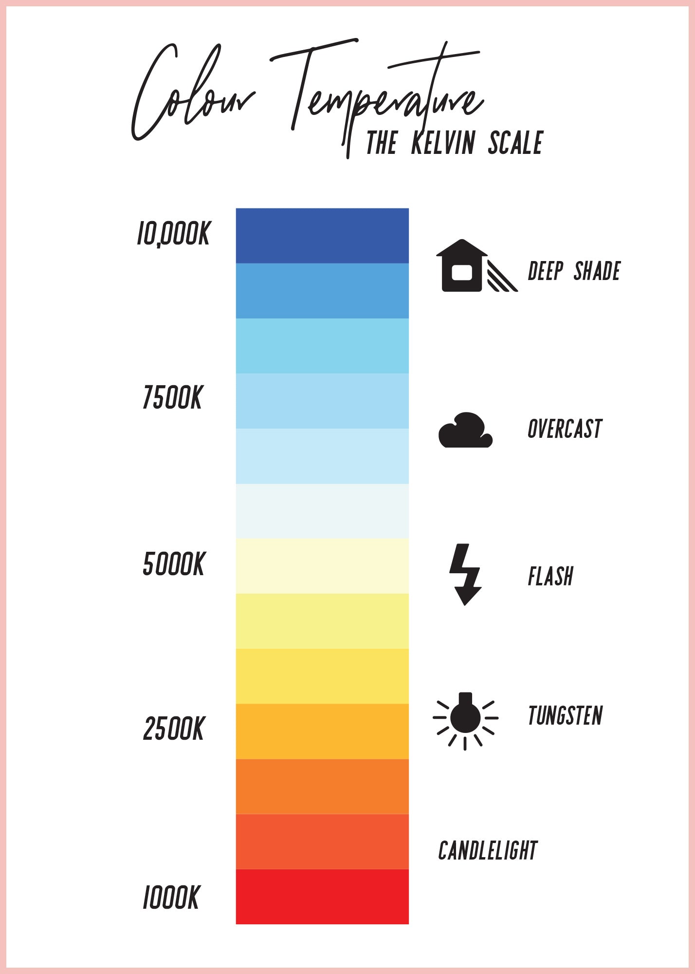
While temperature affects the reds, oranges and blues in a shot (and can be all you need when working with natural illumination, like the outdoor sun) there may be times when other light sources or environmental reflections can give an unwanted colour cast to your shots. This is where Tint comes in. Tint is a measurement of how much green is present in your image. As many fluorescent and LED bulbs emit a greenish light, it is important for any photographer who uses artificial light to compensate for this.
Auto vs. Manual White Balance
The Auto White Balance (AWB) setting on a DSLR camera will use the available light to make an estimate of the correct temperature and tint. Under most conditions it should produce pretty good results, but you may find the colour balance changing from shot to shot. This is due to the fact that, in Auto mode, the camera will re-sample the light for every shot you take. Although the lighting conditions may remain the same, the camera's estimate of the lighting is liable to change.
There are also options for White Balance presets which can be used in a variety of different lighting conditions. These are useful for photographers whose lighting fits neatly into the preset categories. On most cameras these will include: Daylight, Cloudy, Flash, Shade, Tungsten and Fluorescent.
But there are situations where the presets don't quite get it right. For the most accurate colour balance, which will work under different natural and artificial lighting conditions, you will find that the best results come from the Custom White Balance settings.
How to use a Grey Card
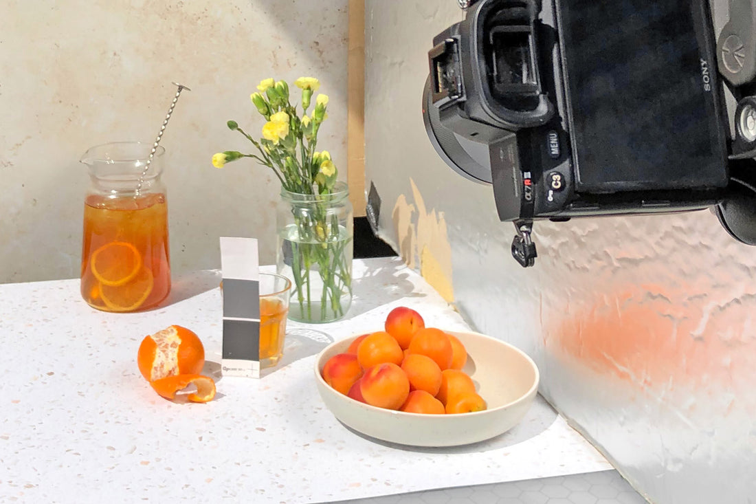
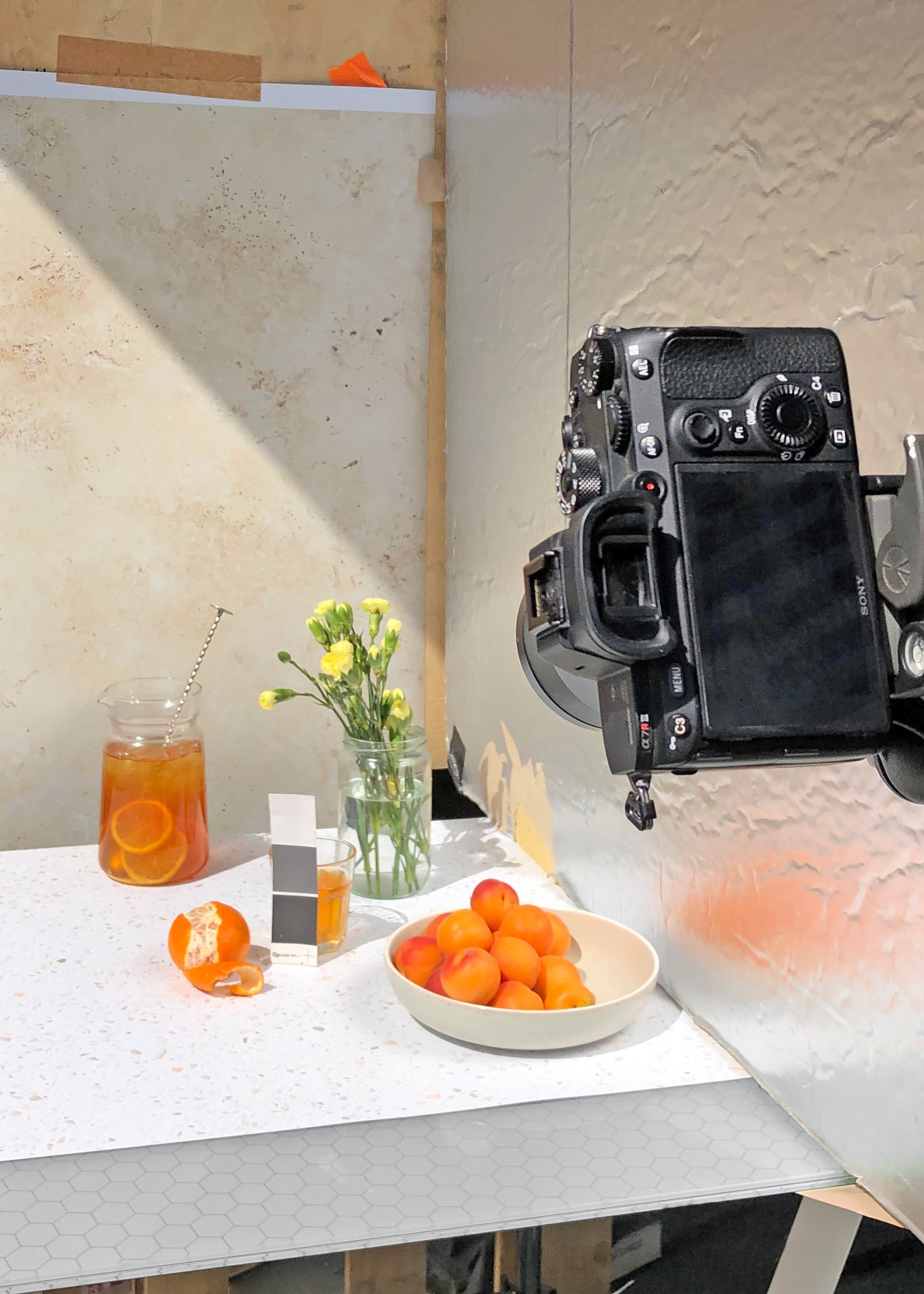
A grey card is exactly what it sounds like! It is a perfectly calibrated, neutral reference point which allows your camera to pick the correct custom white balance settings. We use these small ones from Wex in the studio, but they are available in a a variety of different sizes and styles.
To use the grey card, all you do is place it into the scene that you are photographing, ideally in the position of your subject. The card should be angled so that it catches a good amount of light. On your camera, navigate to the 'Custom White Balance' option in the White Balance menu, and follow the instructions to take a reference shot. This will adjust the temperature and tint so that the grey registers as neutral under these lighting conditions. This setting will then be applied to all subsequent shots, until you switch to a different mode (Auto, Preset) or reset the custom white balance using the same method.
Grey cards can be used to set white balance either in-camera or with the eyedropper tool in capture software. Be sure to select a point on the grey card that catches as much light as possible:
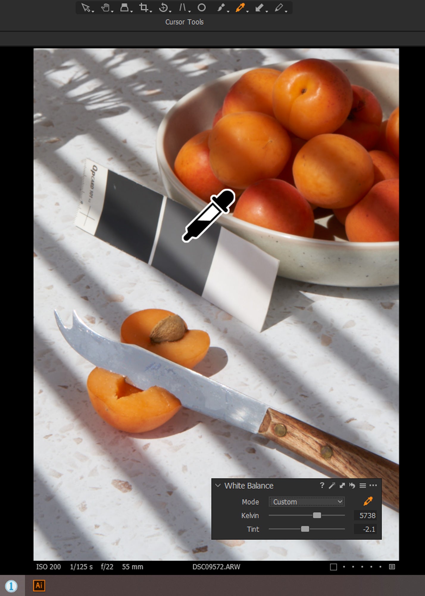
If you are shooting tethered, or prefer to adjust white balance in post-processing, you can use software such as Capture One or Lightroom to select a neutral grey point. Phone shooters can achieve the same results with editing apps like Snapseed (which we will be covering in greater detail in a future blog post).
After taking a shot, go to the 'White Balance' tool. Select the eyedropper and click on the grey card. The settings will again be adjusted to neutralise this point, and can either be set for subsequent captures, or copied and applied to other images in the same session.
Lighting for Neutral Images
If white balancing is to work properly, the light that you are using should be consistent. For example, if you have two standard tungsten household lamps illuminating your scene, and there is no daylight or other ambient light spilling into the shot, you should get great results after using a grey card. The colour balancing will 'cool' the warm tones of the tungsten light, creating a neutrally balanced image.
However, if you use a mixture of lights with different colour temperatures, such as one fluorescent bulb, one tungsten light and some ambient daylight from a window, this image will be impossible to neutralise. You will see that parts of the photograph will have different colour casts.
So, if you are looking to achieve the best colour fidelity, it is important to use lights that can correctly balance with one another.
Using Colour Balance Creatively
Whatever your final vision for your image, it can be extremely helpful to use neutral White Balance while shooting, or as the first step before retouching. This means that there is an objectively correct version of the colours, which can then be manipulated later to produce the creative results you prefer.
We used Capture One to select the white balance for this shot, based on an earlier image which included our grey card for the neutral reference. The image was lit with fluorescent bulbs that had a slight green cast:
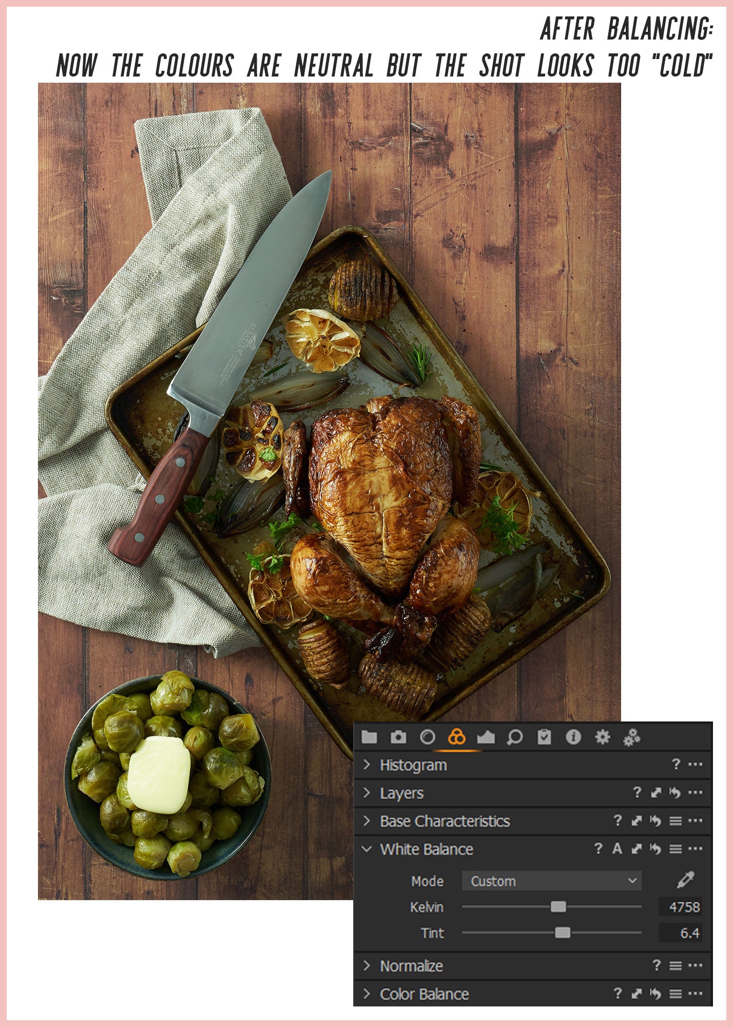
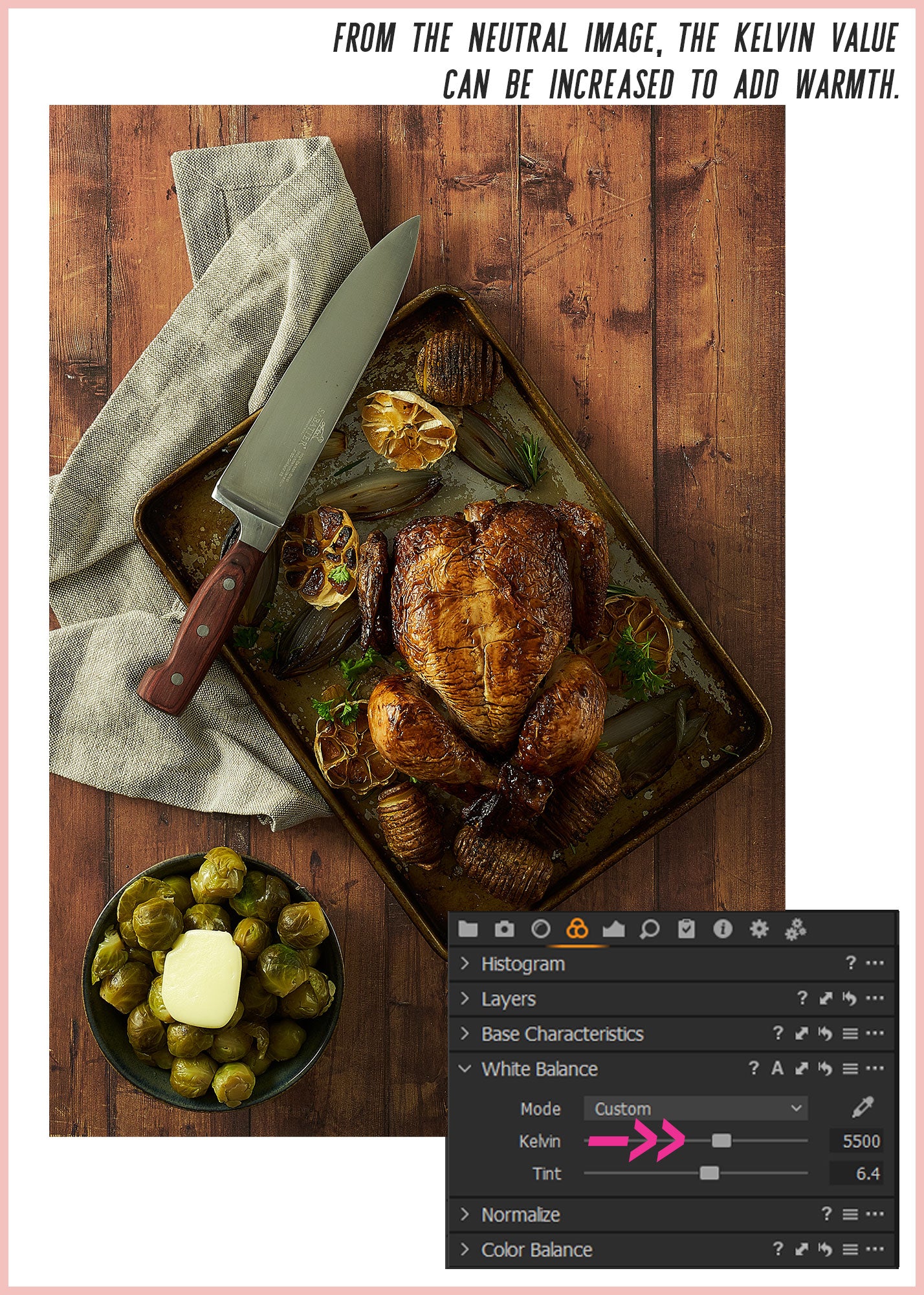
After correcting the image to an objectively neutral point, we wanted to use the colour balance to suggest more warmth - in keeping with the mood of a casual, homely table-setting. So, from the neutral settings, the Kelvin value was slightly increased, 'heating' the image up while preserving the correct tint value. This keeps the image looking natural and avoids any odd green/magenta colour casts.
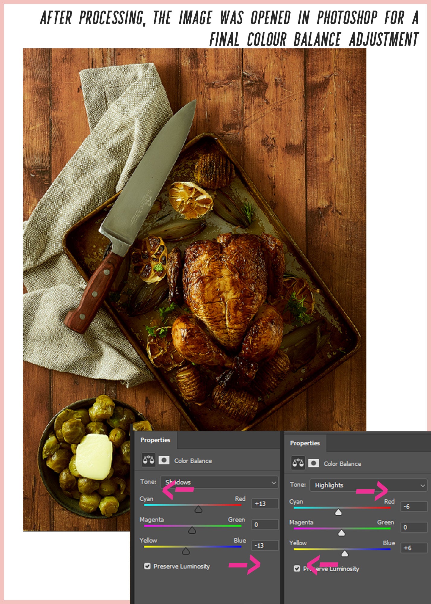
For an extra boost of warm tones, you can also adjust the colour balance of the shadows and highlights. Shifting the shadows towards red and yellow, while moving the highlights slightly towards blue and cyan. This preserves the overall neutrality of the image - while at the same time adding significant depth and richness to the darker tones.
That's all for this post. We hope this quick overview has helped you get to grips with white balance and colour correction, and shown how this super-simple function can seriously up your photography game 📸😎
So, happy snapping for now, and see you in the next post!